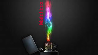
The idea changed and the font was placed next to the flame. This is a clever idea as even though the word is matchbox the visual is a lighter which is ironic. As the ideas progressed they changed to suit the logo and company. More ideas have been discussed so this is not the final idea.
Another idea was to have a green backgorund with the font over the top this is a simple and eye grabbing design. This meets all the criteria for a ident.

We will decide on a final design next lesson.
No comments:
Post a Comment