Friday 21 January 2011

Ident drafts

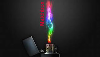
We started off putting fonts and shapes of words together to try to create a logo, we ended up attempted to do a logo on photoshop, it was very simple with a lighter being lit with the word on it.
The idea changed and the font was placed next to the flame. This is a clever idea as even though the word is matchbox the visual is a lighter which is ironic. As the ideas progressed they changed to suit the logo and company. More ideas have been discussed so this is not the final idea.
Another idea was to have a green backgorund with the font over the top this is a simple and eye grabbing design. This meets all the criteria for a ident.


We will decide on a final design next lesson.

Warner Brothers


The Warner Brother's production logo, uses buildings to represent the 'W' & 'B' of the logo, this relates to the dream world in the film and the image of the city moving, which it does in the film. Using the city t represent the letters shows the setting on the film, and also adds to the hype of the film as Warner Brothers are prepared to change their logo for the film.

Idents

Regency Ident:

Regency productions produce serious films from thrillers to action and even comedy.
The ident is suitable to the company because it is subtle and serious, with not a lot of action just a subtle R this gives off the correct image for the target audience and is suitable in the opening scenes of a thriller film.


Monday 17 January 2011

Analysing 2 Post Student Videos


 Holding a shot steady were appropriate:
 The camera was used appropriately throughout the filming
Using a variety of shot distances:
The group only filmed using only close ups which doesn't give the viewer a chance to understand the surroundings, but you could make an assumption of the setting from the soundtrack and gore.
Shooting material that appropriate to the task:
although the opening was very creepy, the material was more of a horror genre, as the amount of blood and gore used was a bit too much for the average thriller.
Selecting mise-en-scene 
The audio used was all non diagetic, with the soundtrack consisting of young girl laughing which is contrapuntal. The lighting was quite dark which created an creepy atmosphere. The location; as you can't really tell because of the such close camera angles, you could imagine.


The Yearbooks soundtrack suited the clip very well, they didn't use enough variety of camera shots, mostly used close ups which didn't  but props were used really effectively,

Analysation of Student Videos

http://51thriller10.blogspot.com/

This opening thriller sequence made by this group was very well thought out and conforms to the marking scheme for the opening sequences.

Holding a shot steady where appropriate:
They managed to hold the shots steady during the shots were it was  necessary the handheld shots also add a good effect.

Using a variety of shot distances:
There was plenty of variety in shot lengths with an emphasis on close-ups this creates a more intimate feeling with the opening sequence.

Shooting material appropriate to the case:
the material is very thriller-esque you are not entirely sure what is going on but it still entices you to carry on watching to find out.

Selecting the mise-en-scene in shot:
The mise-en-scene has not been thought through very well as the things in shot change depending on the shot and  character. The way the mise-en- is portrayed is also quite confusing as you are not sure what has importance.

Editing so the meaning is apparent to the viewer:
The meaning is very clear to the viewer yet still keeps some mystery from the viewer enticing you to watch on.

Using titles appropriately:
This was probably the best thing about this clip the titles were very proffesional and help add to an overall effect of professionalism. The way it is imposed on the scenery forces you to look for them slightly and they take you by surprise.